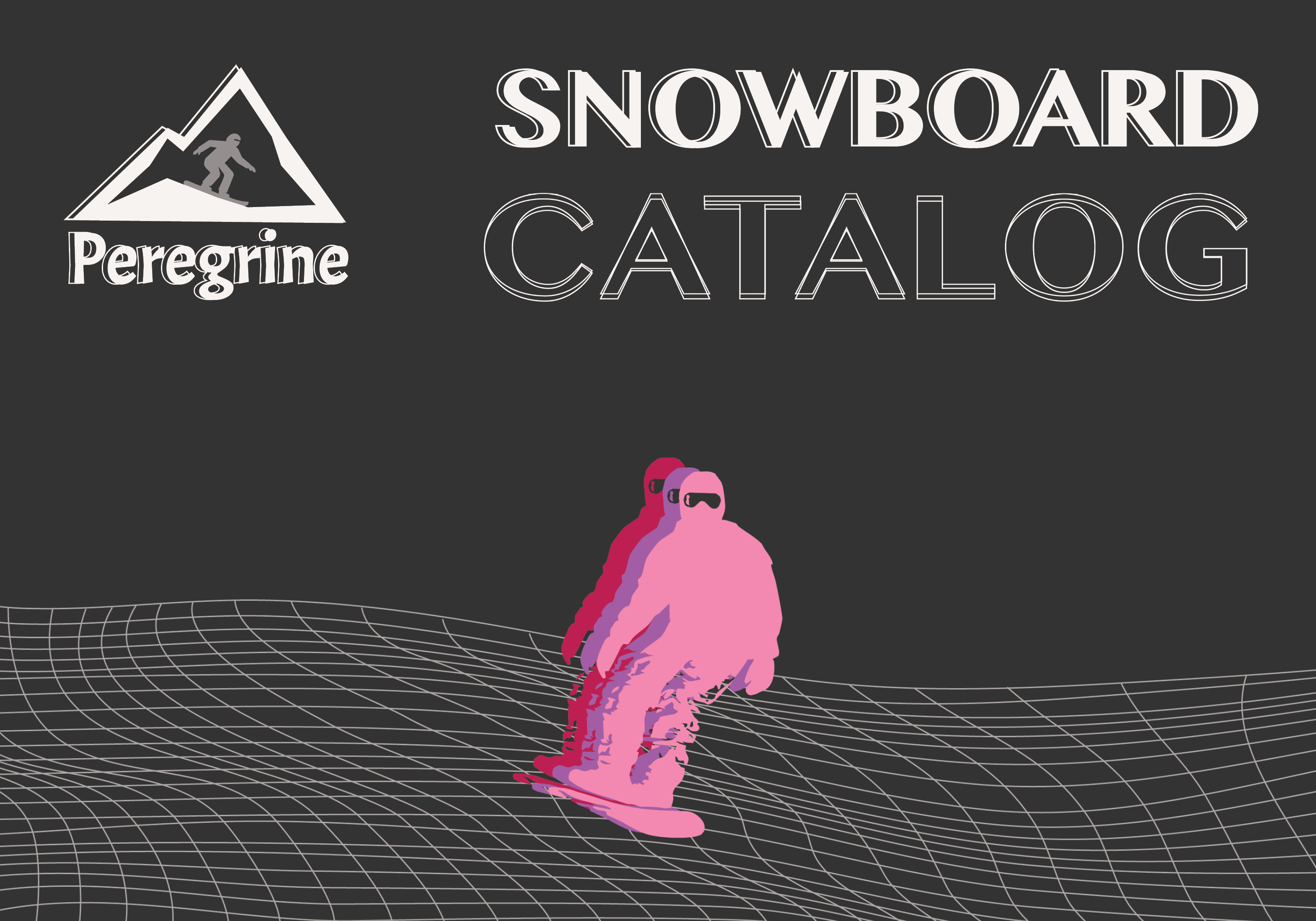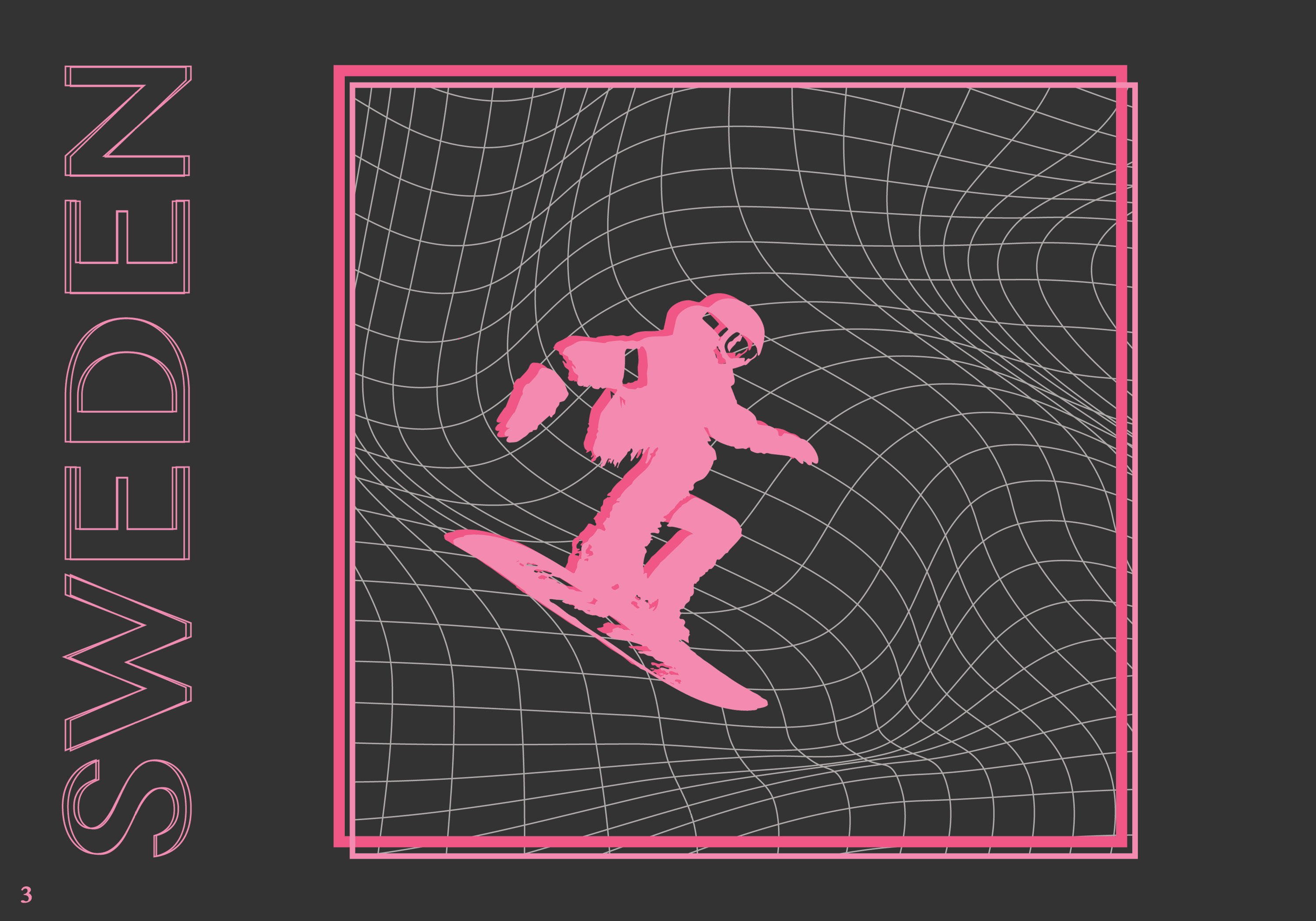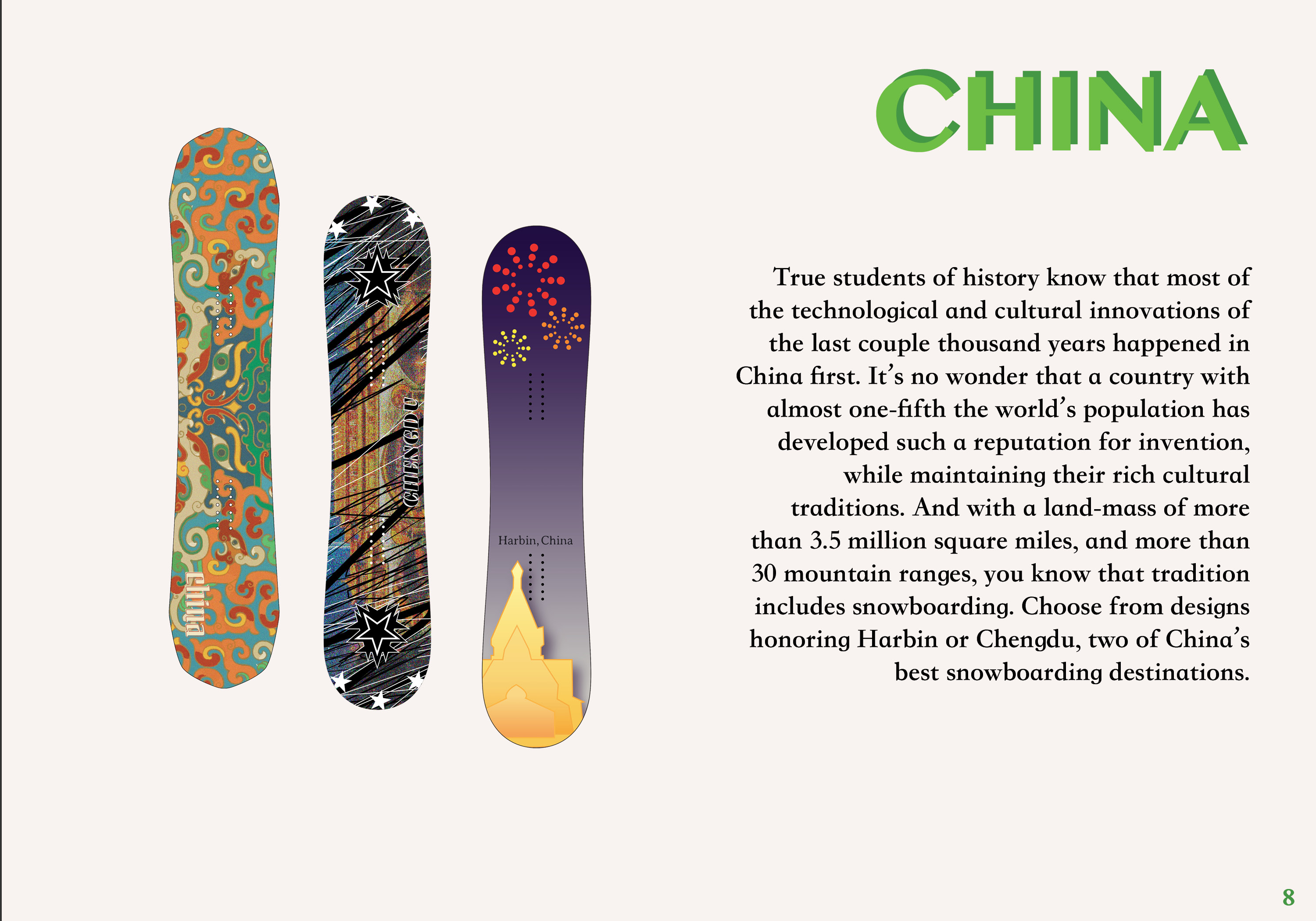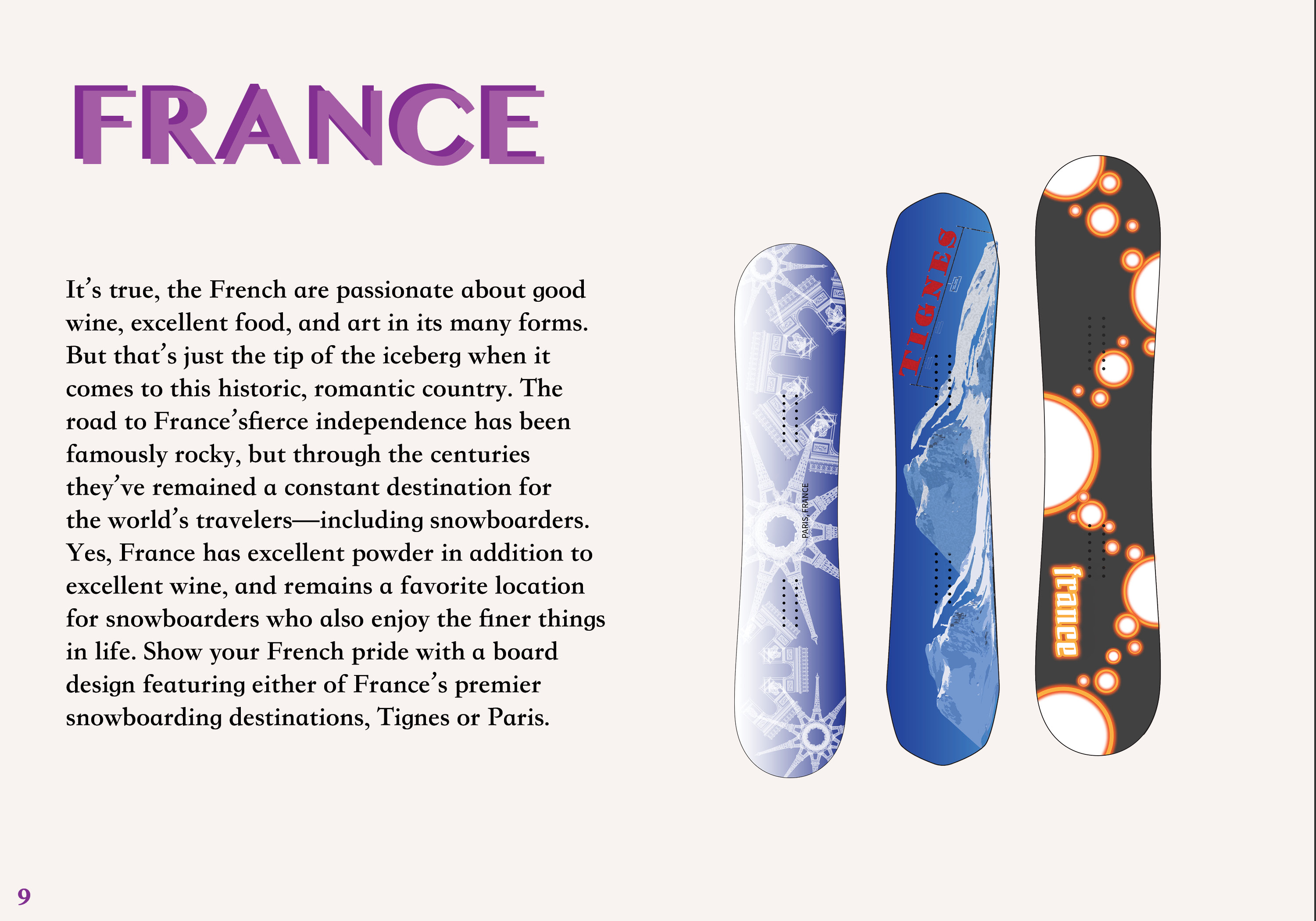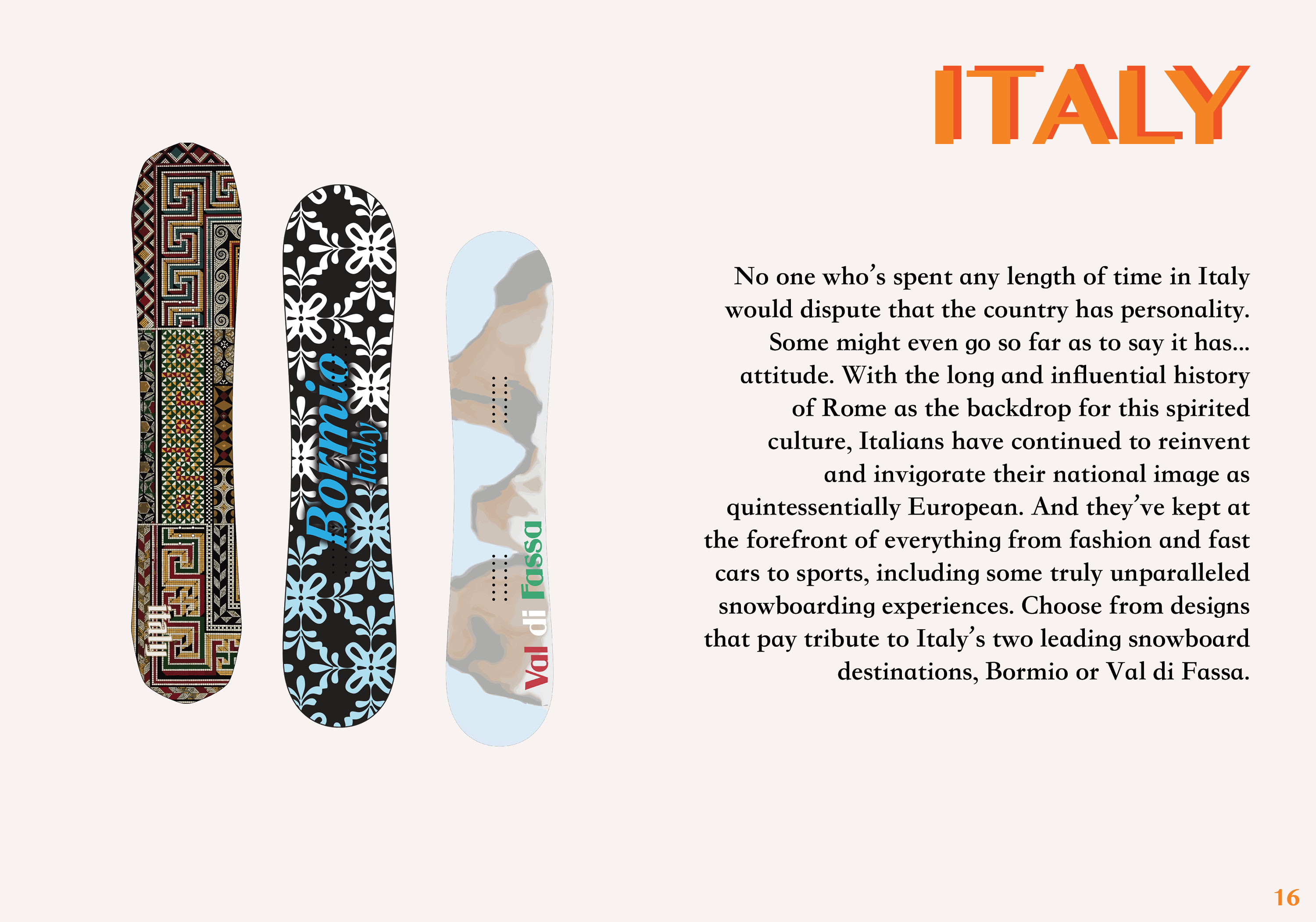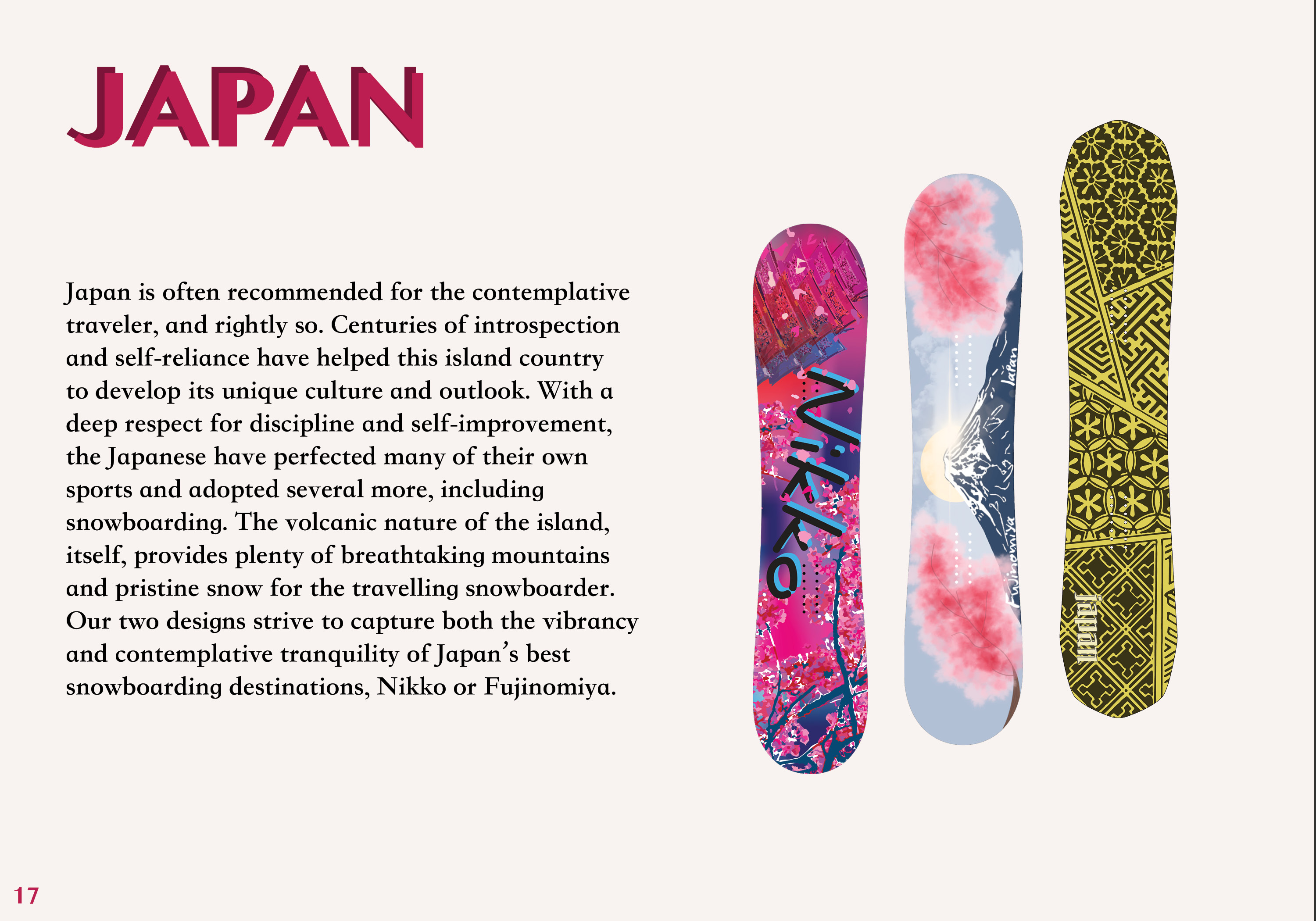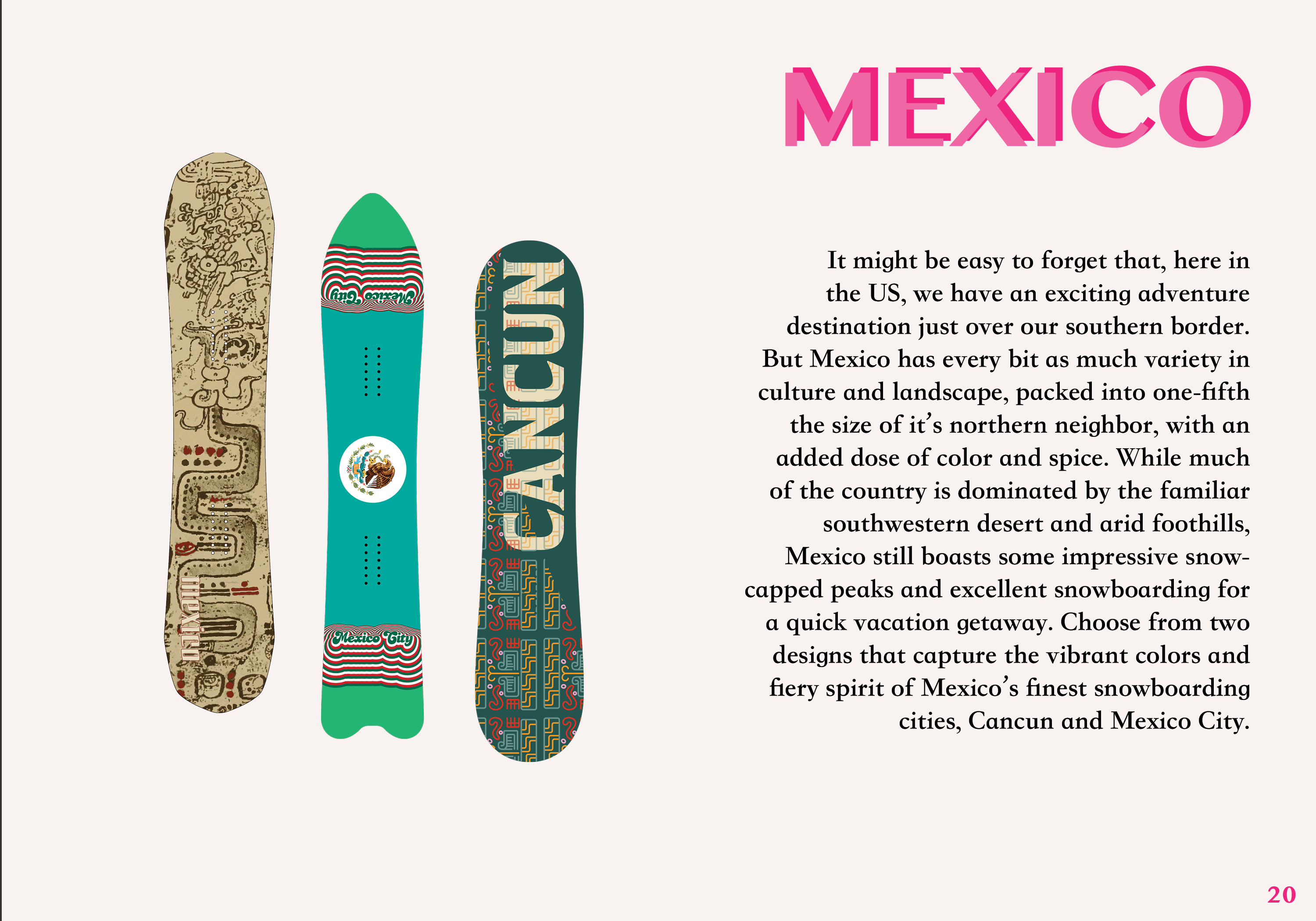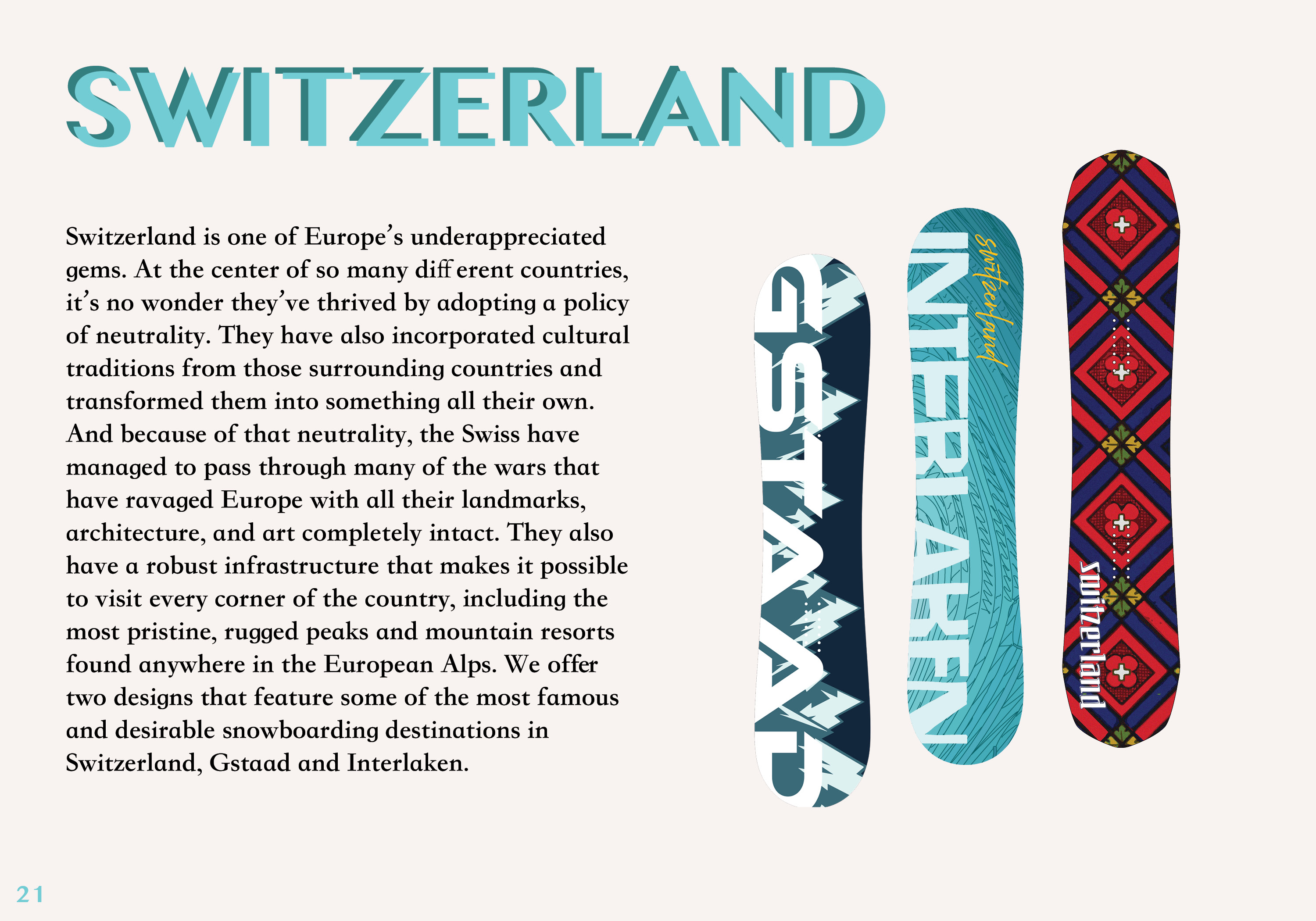
Concept
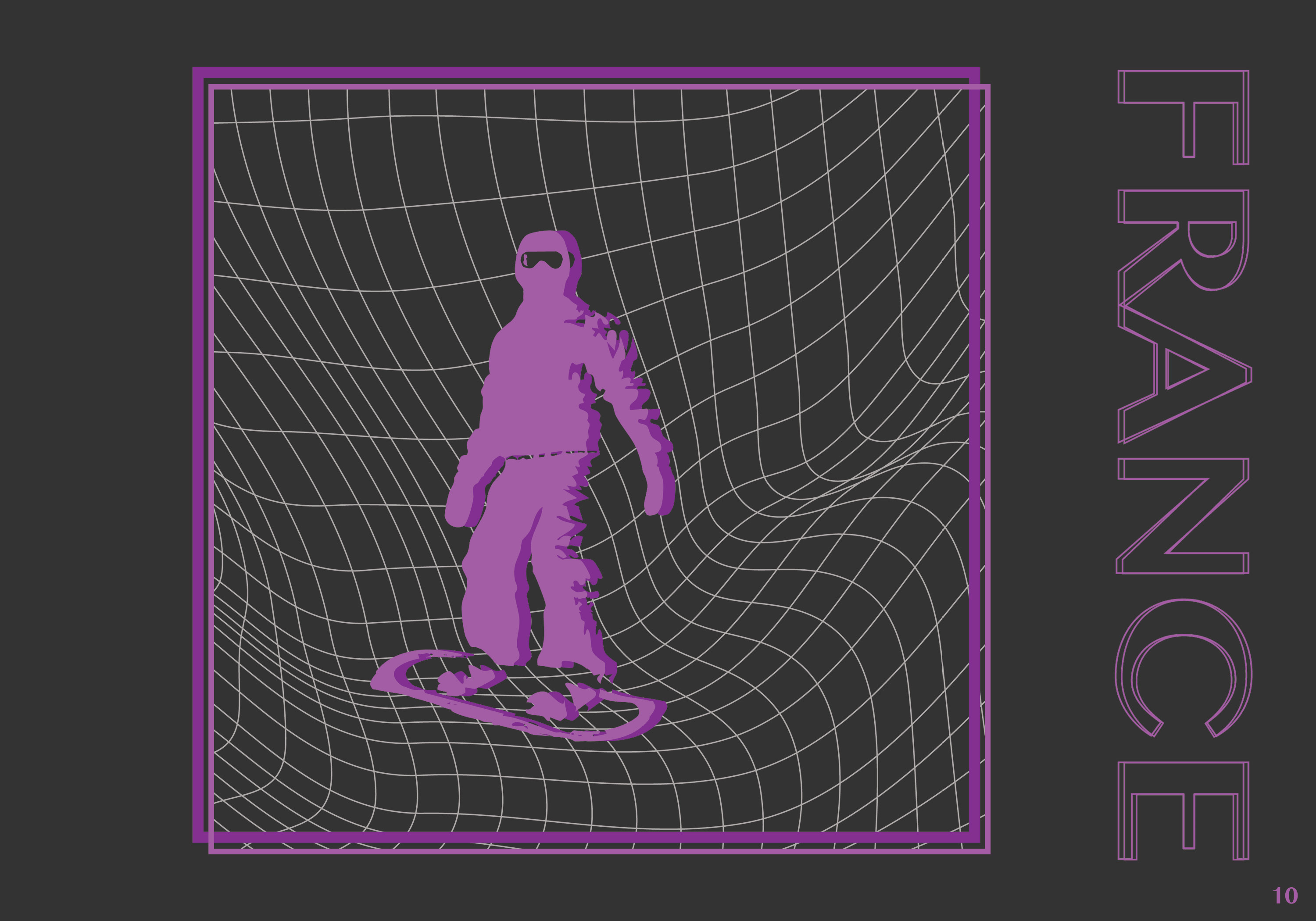
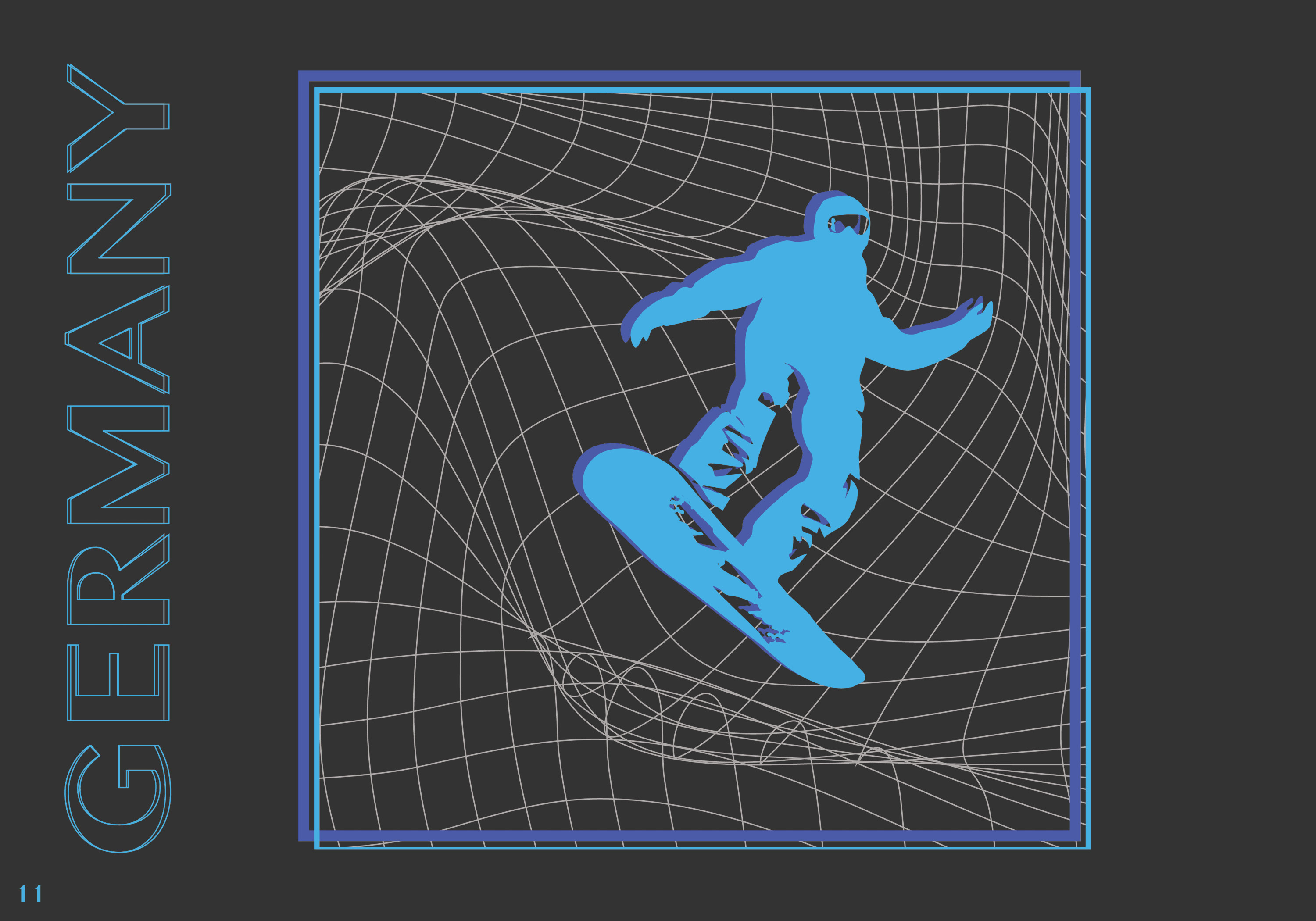
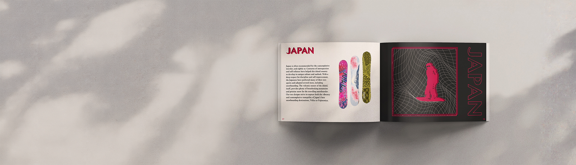
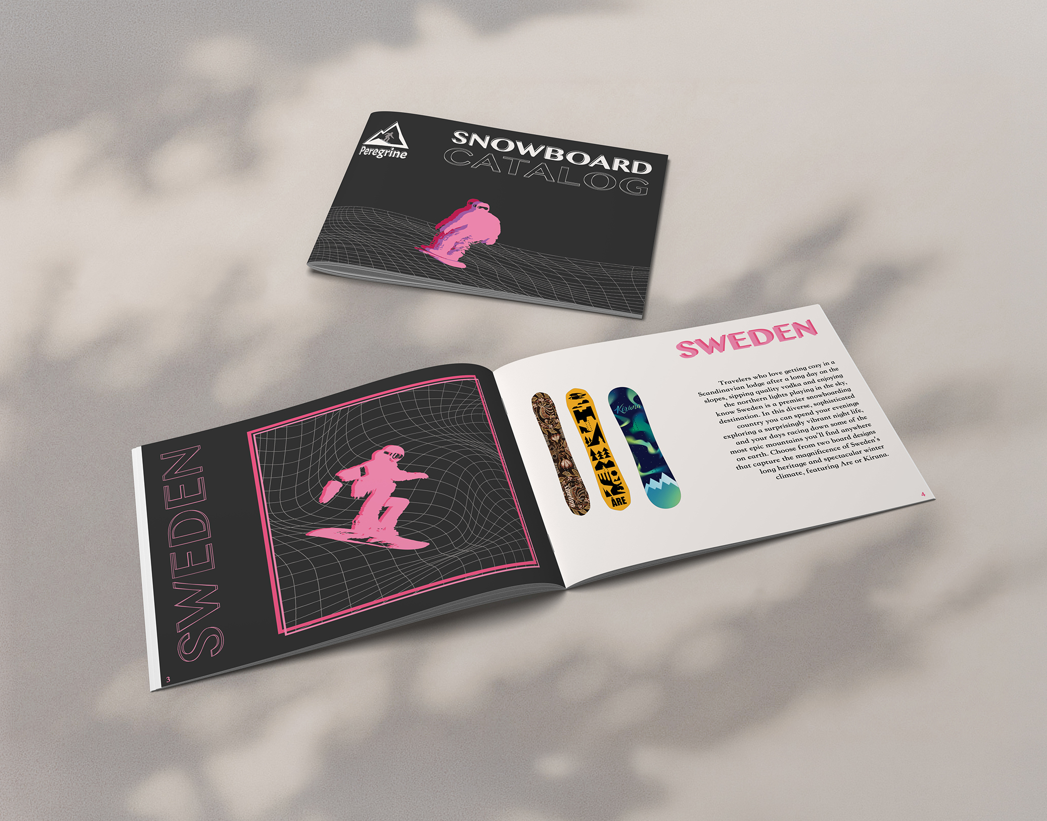
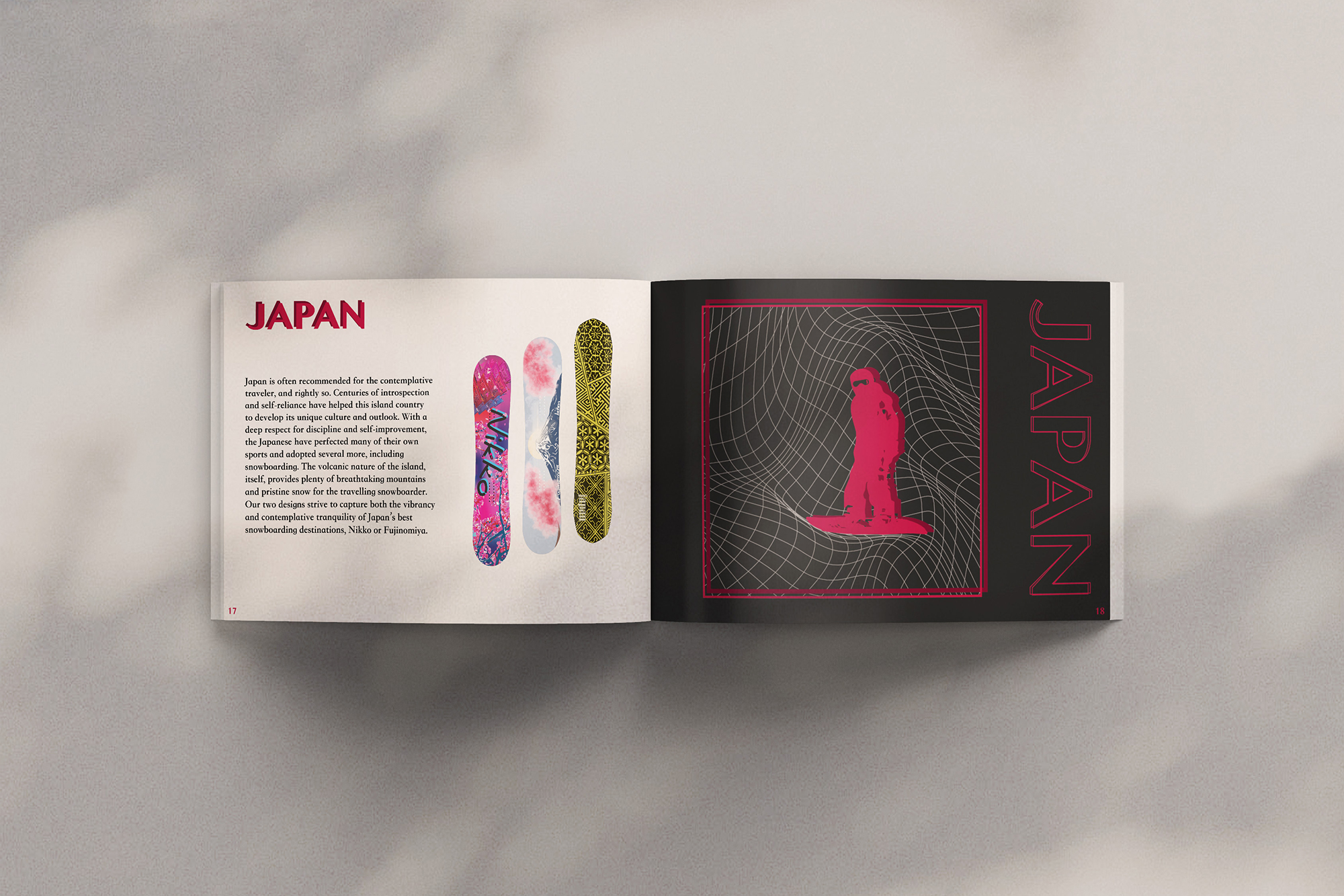
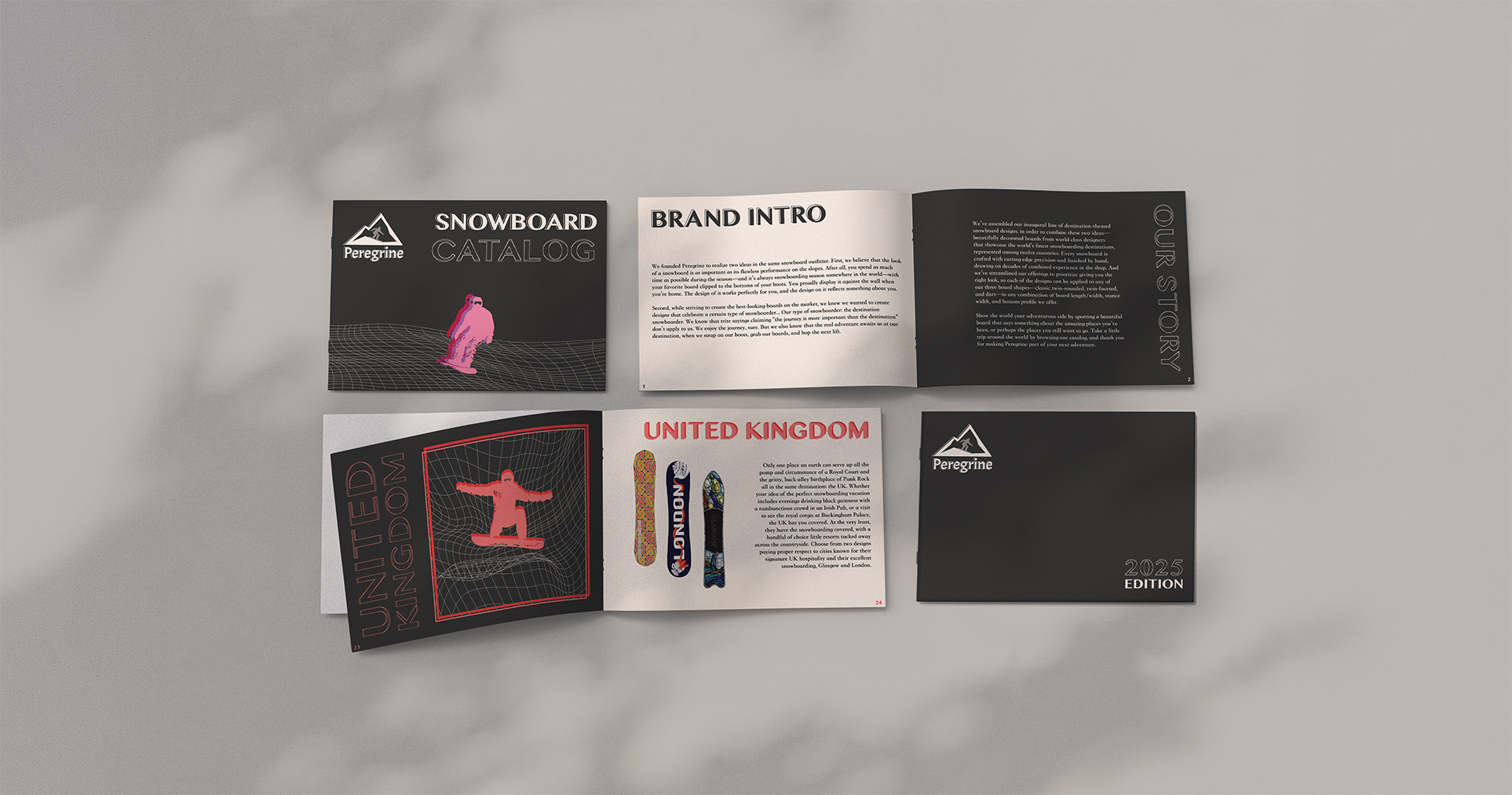
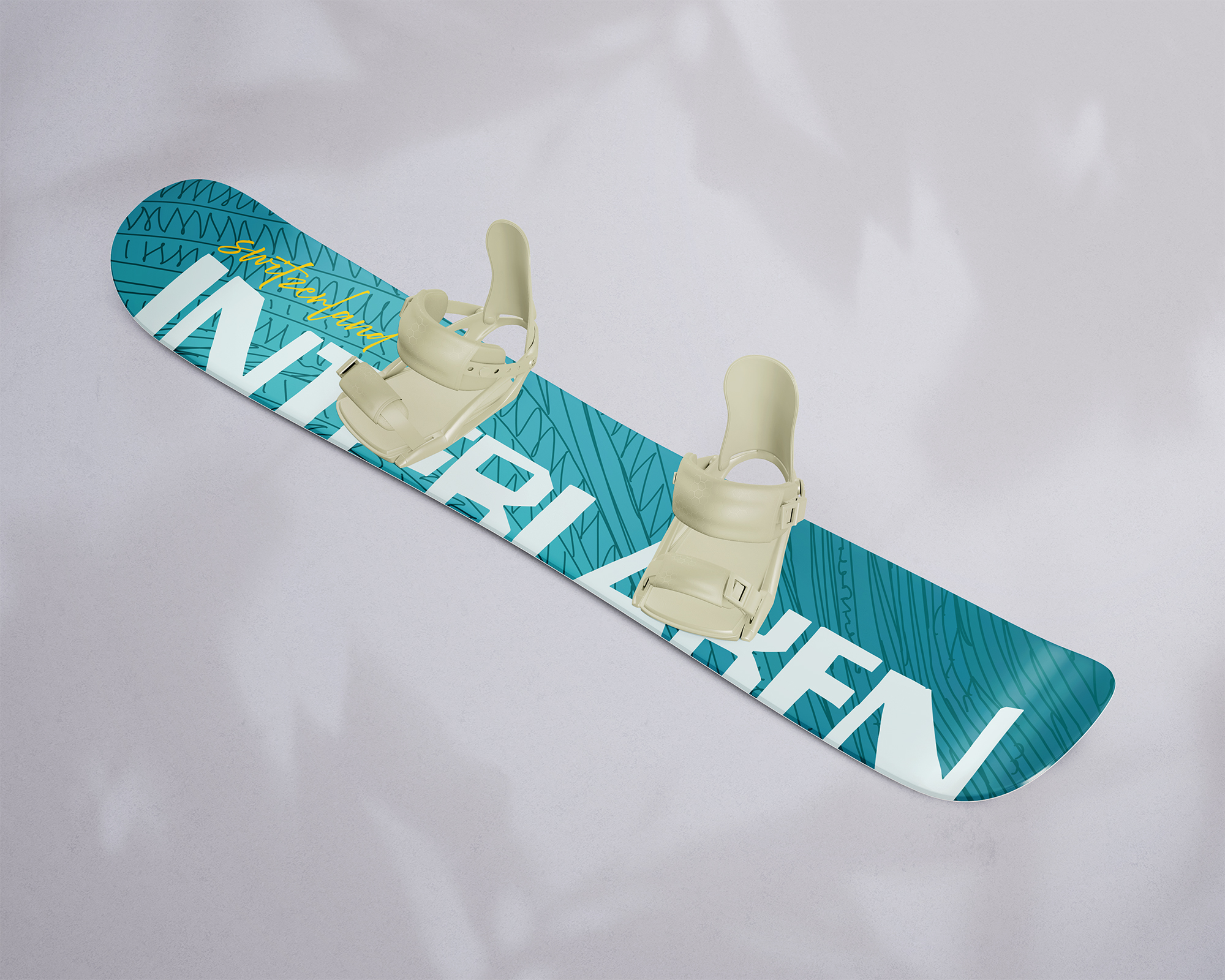
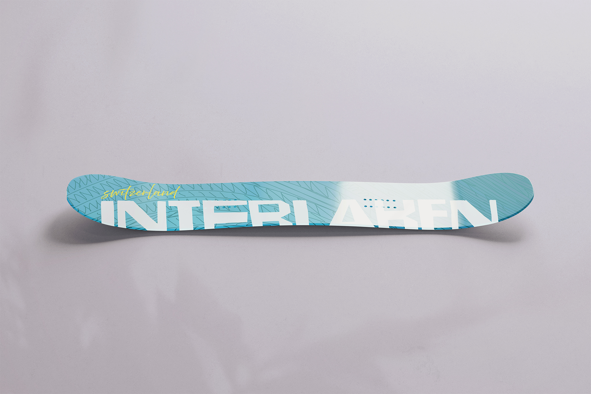
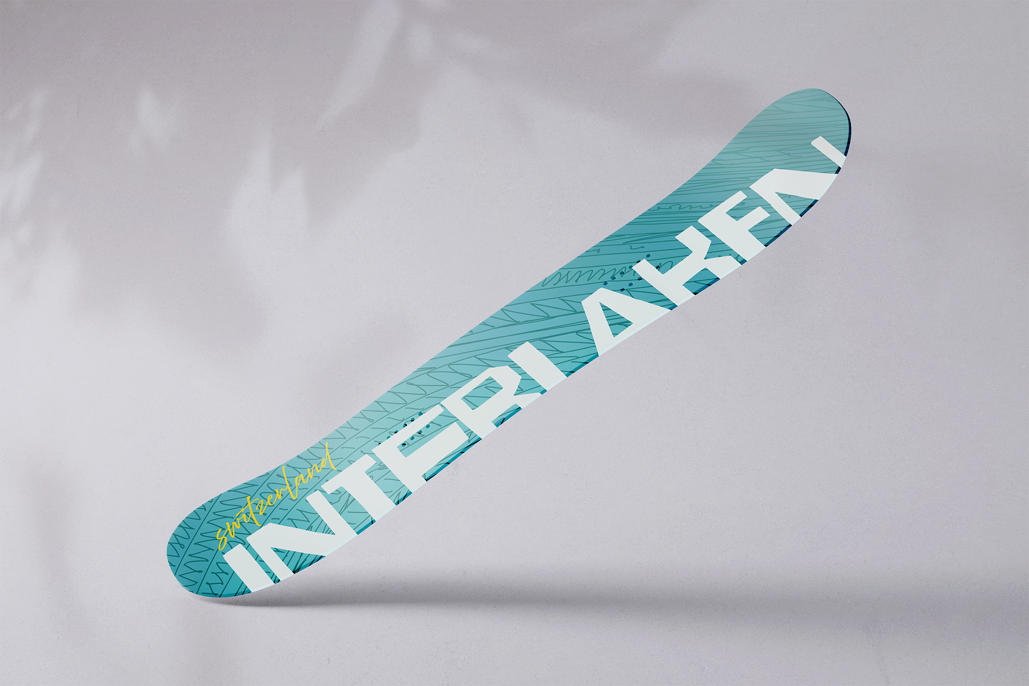
This project focused on developing the foundational visual identity for Peregrine, a fictional snowboard brand centered on world travel and iconic destinations. The brand concept treats each snowboard as a reflection of place, culture, and atmosphere. The identity was introduced through the creation of the Peregrine logo and a destination-based snowboard design inspired by Interlaken, a location known for its alpine landscapes, adventure culture, and balance of energy and calm. This dual focus established Peregrine as a brand that blends performance, exploration, and refined visual storytelling.
Description
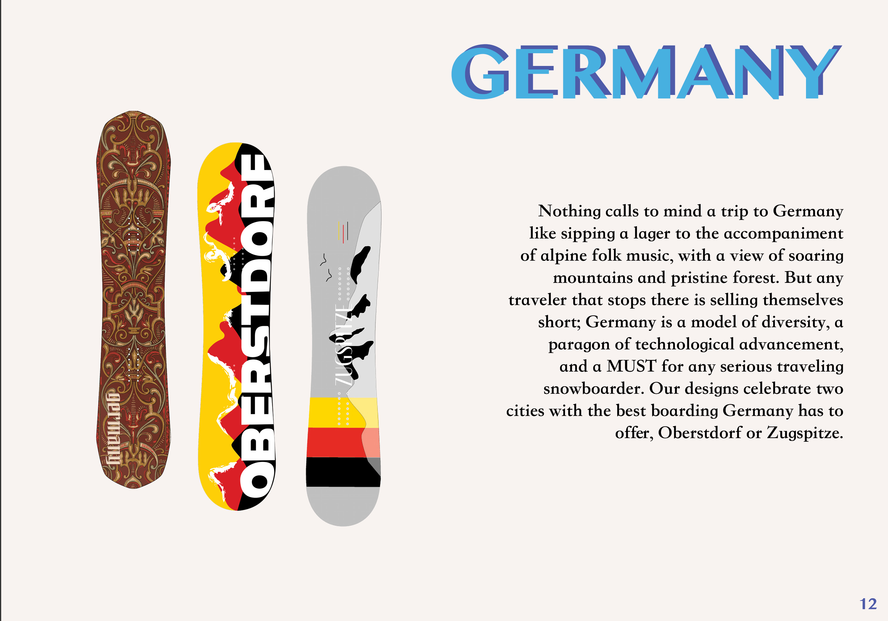
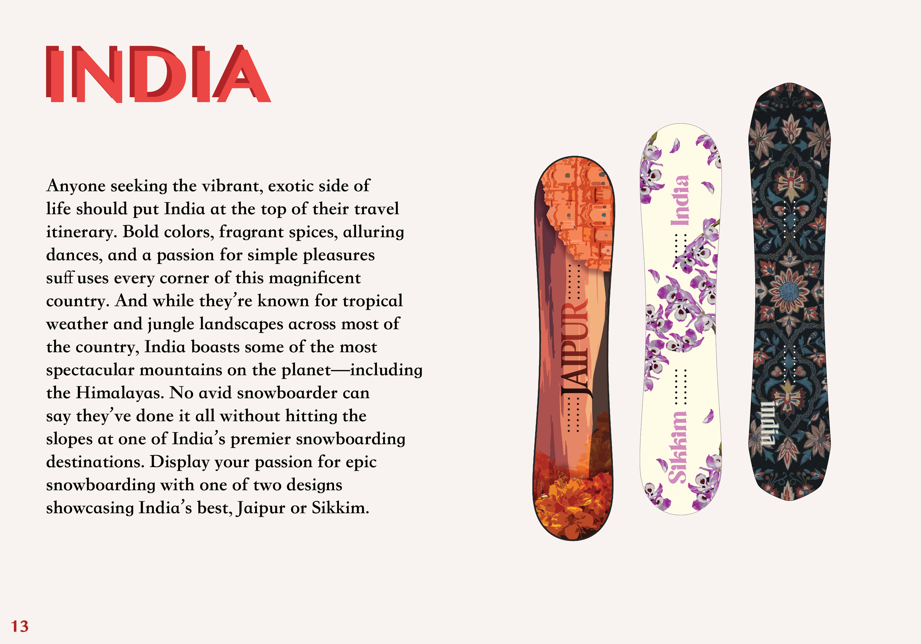
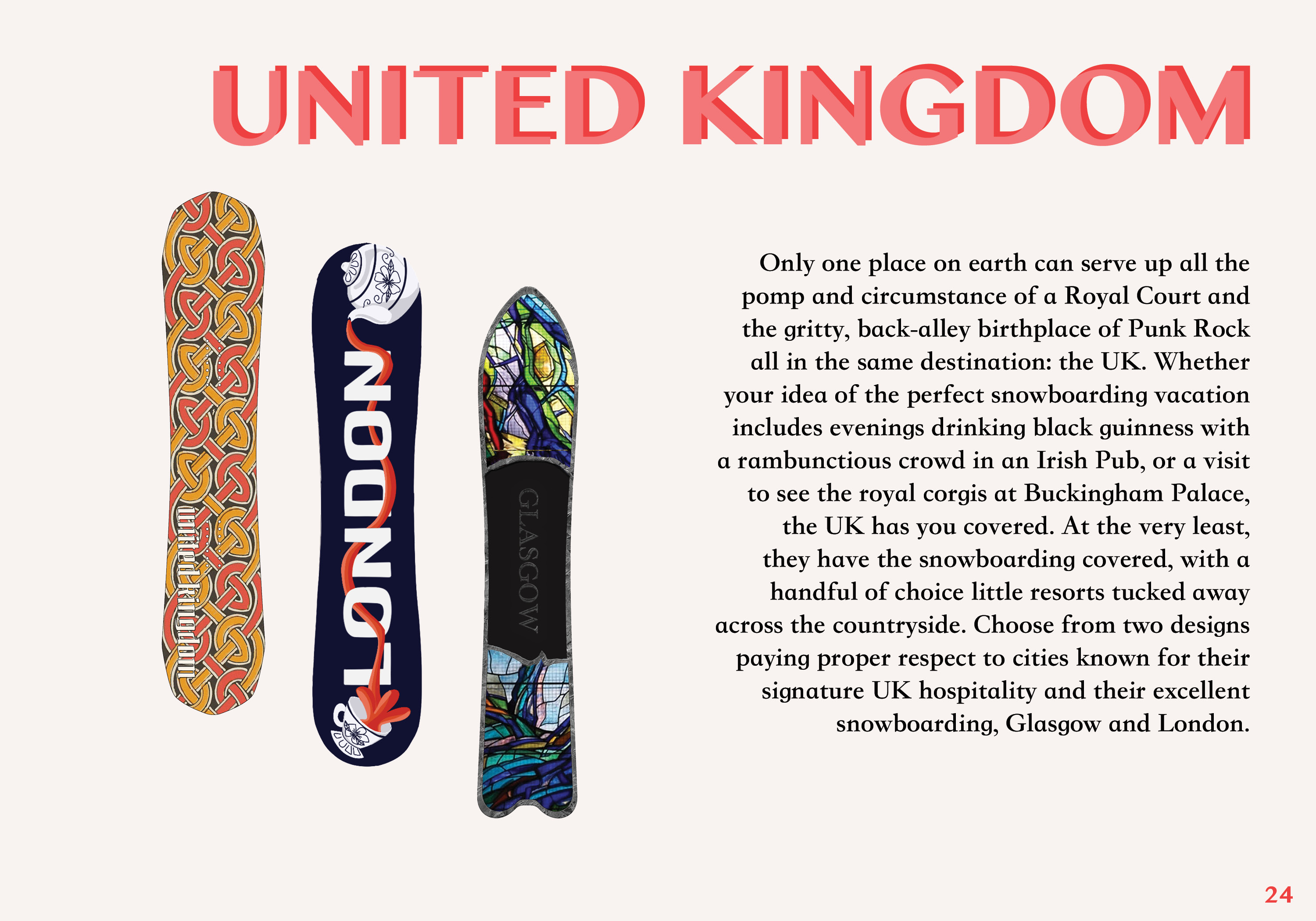
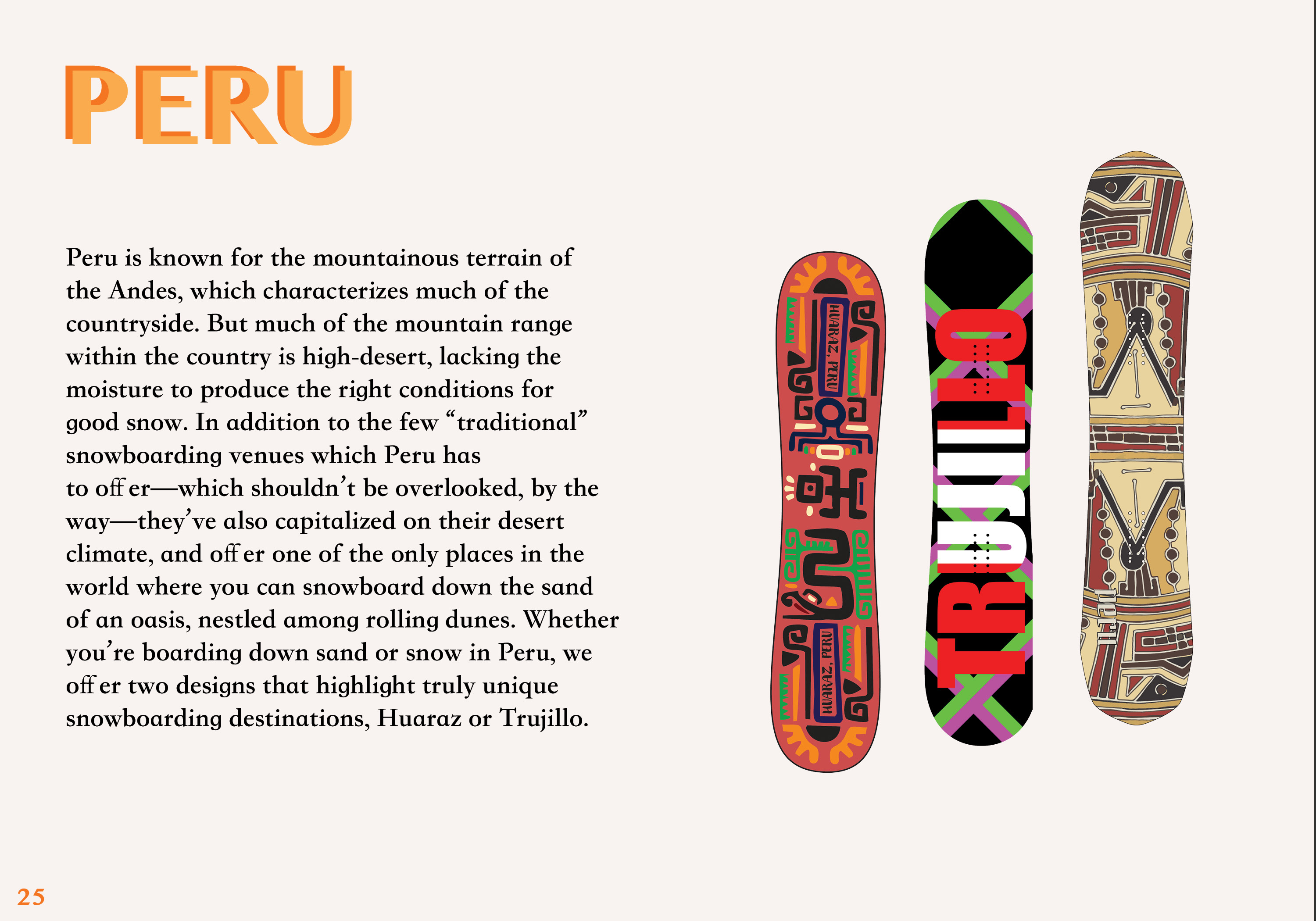
The project began with the design of a clean, versatile Peregrine logo intended to scale across future brand applications. Alongside the identity work, a snowboard graphic inspired by Interlaken was developed using bold shapes, structured composition, and a cool, alpine-informed color palette. The project expanded into a product catalog design showcasing Peregrine's fictional line of travel-themed snowboards. The catalog unified twelve board designs within a consistent grid and layout system, incorporating high-contrast typography, natural textures, and halftone printing artifacts to add depth and tactile character. Together, the identity, snowboard design, and catalog function as a cohesive brand system built for scalability and real-world production.
Typography
The quick brown fox jumps over the lazy dog.
The quick brown fox jumps over the lazy dog.
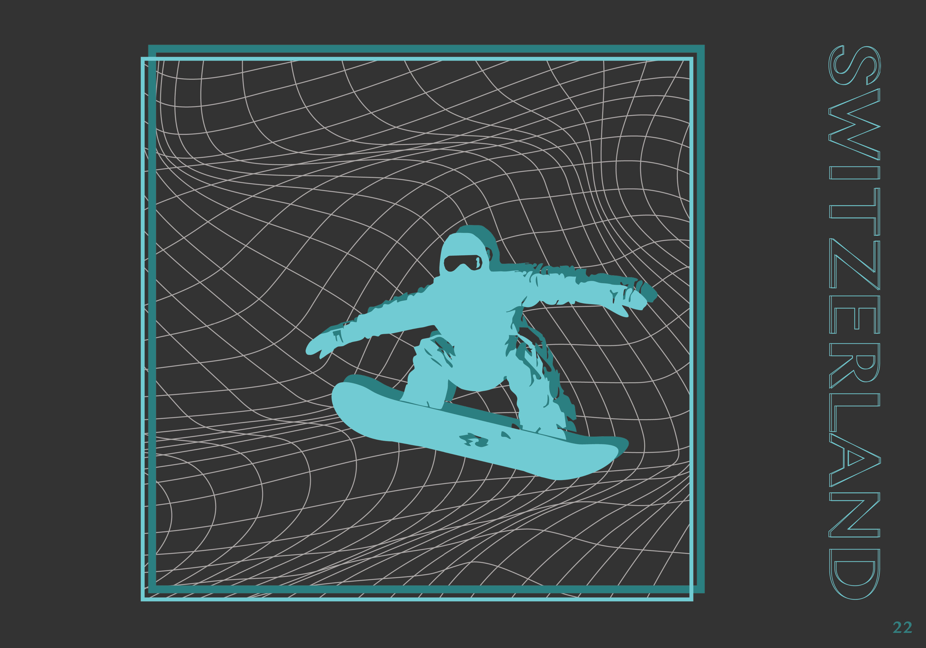
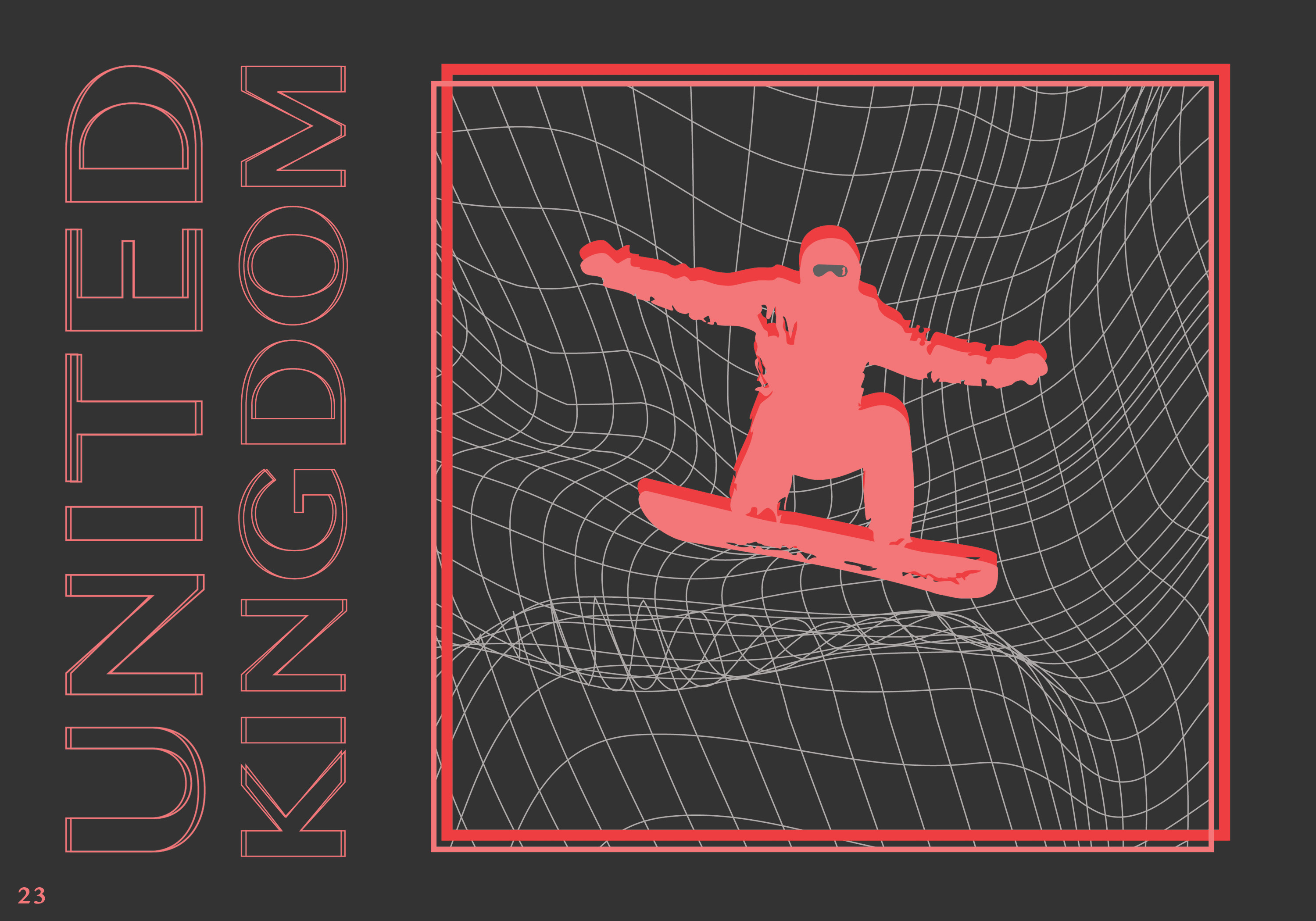
Interactive Catalog