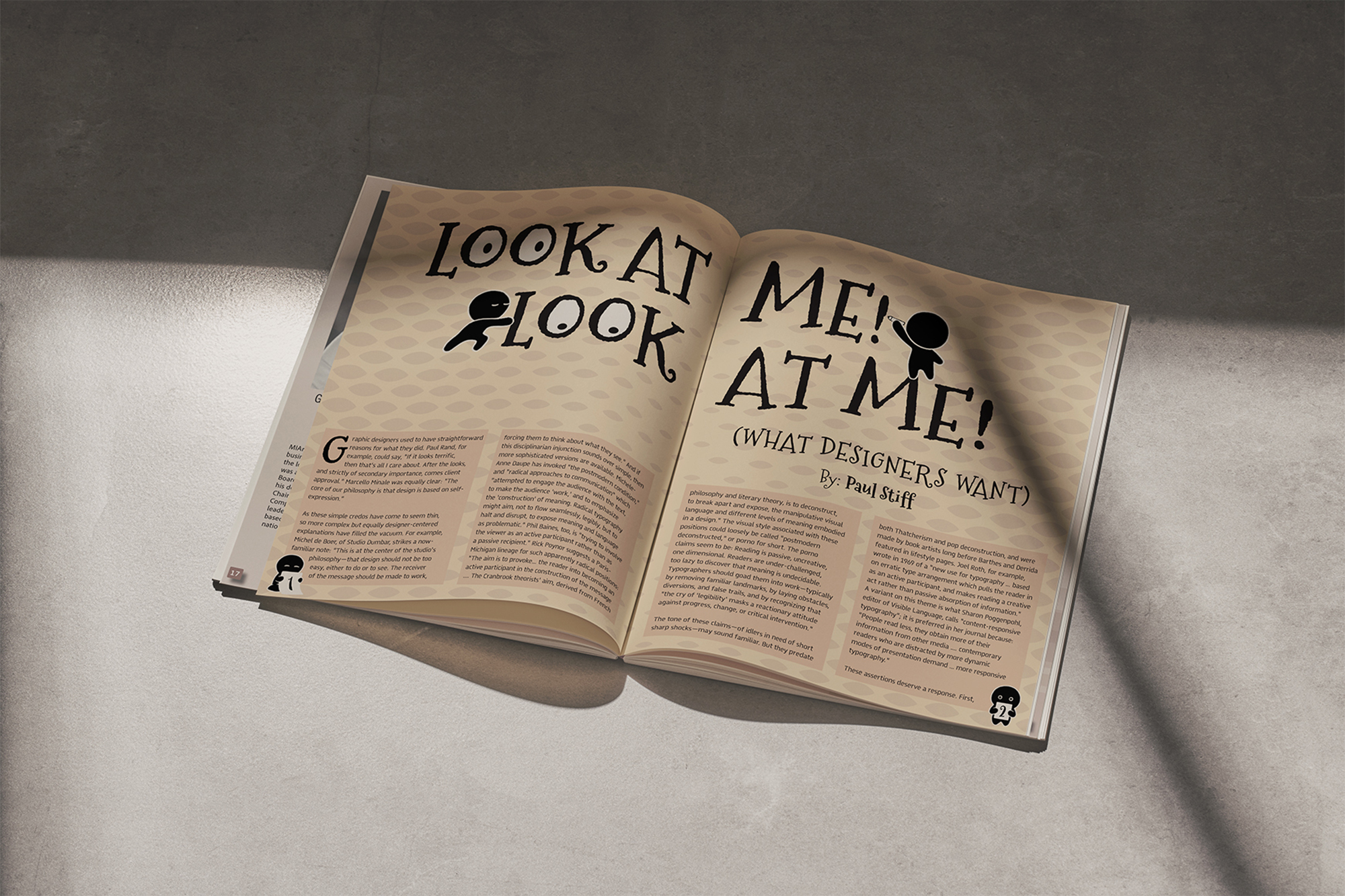
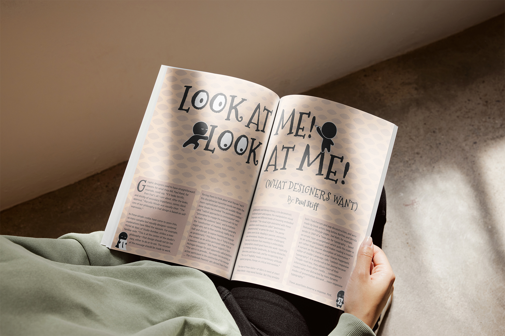
Concept
This project involved designing a multi-spread magazine layout for Paul Stiff's article "Look at Me, Look at Me, What Designers Want." The article critiques how graphic designers often prioritize attention and self-expression over clear communication. The concept focused on translating the article's slightly confrontational, witty, and reflective tone into visual form through layout, typography, and a central editorial illustration that reinforces the critique rather than distracting from it.
Description
The project consists of an opening spread featuring a primary editorial illustration paired with strong typographic emphasis, followed by an interior spread that continues the established visual language. A structured grid system was used to maintain clarity and readability while allowing expressive typographic moments. Hierarchy, pacing, and negative space were carefully considered to guide the reader through the content while subtly echoing the article's commentary on visual excess and designer ego.
Visual Assets

Interactive Magazine Spread