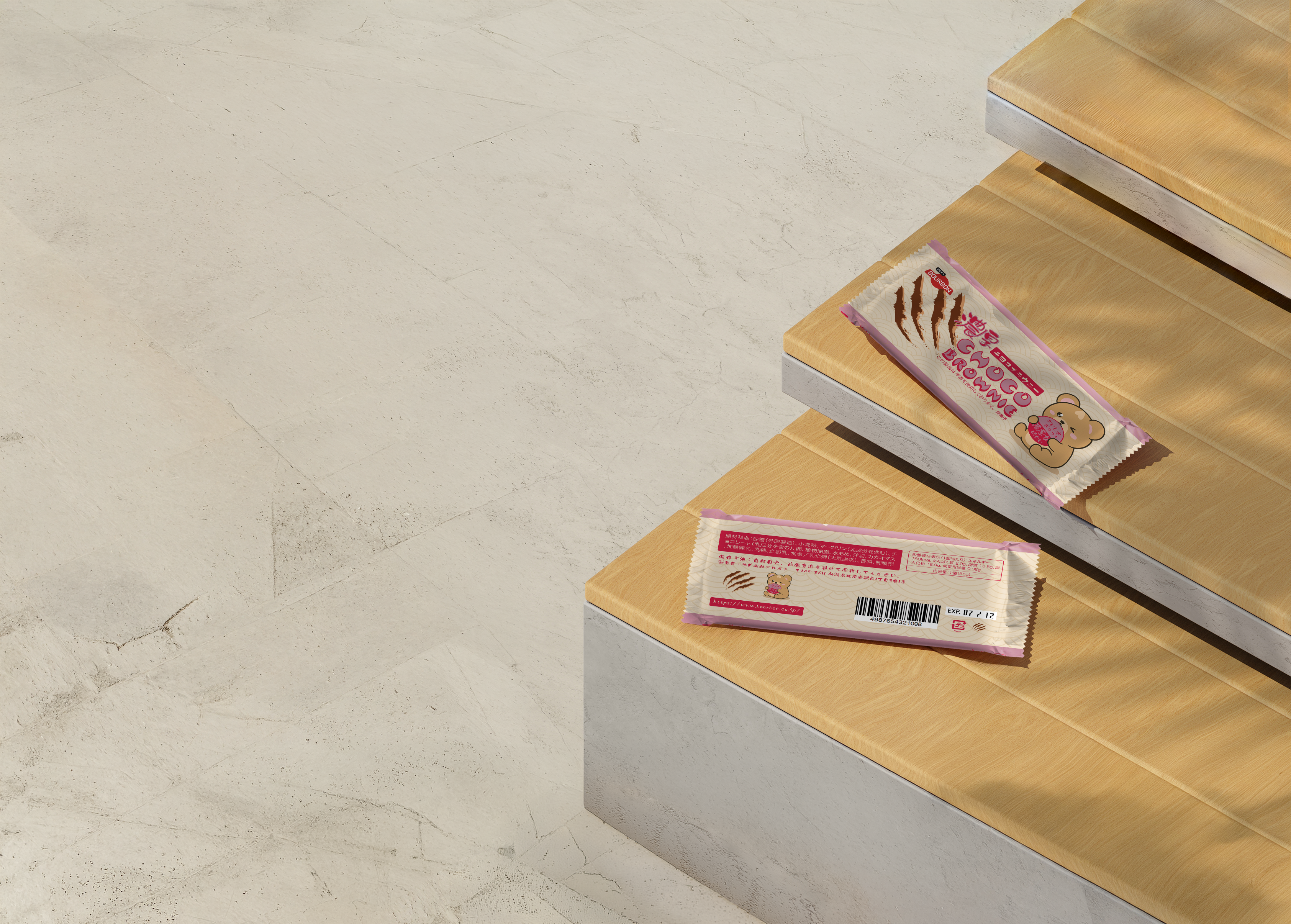
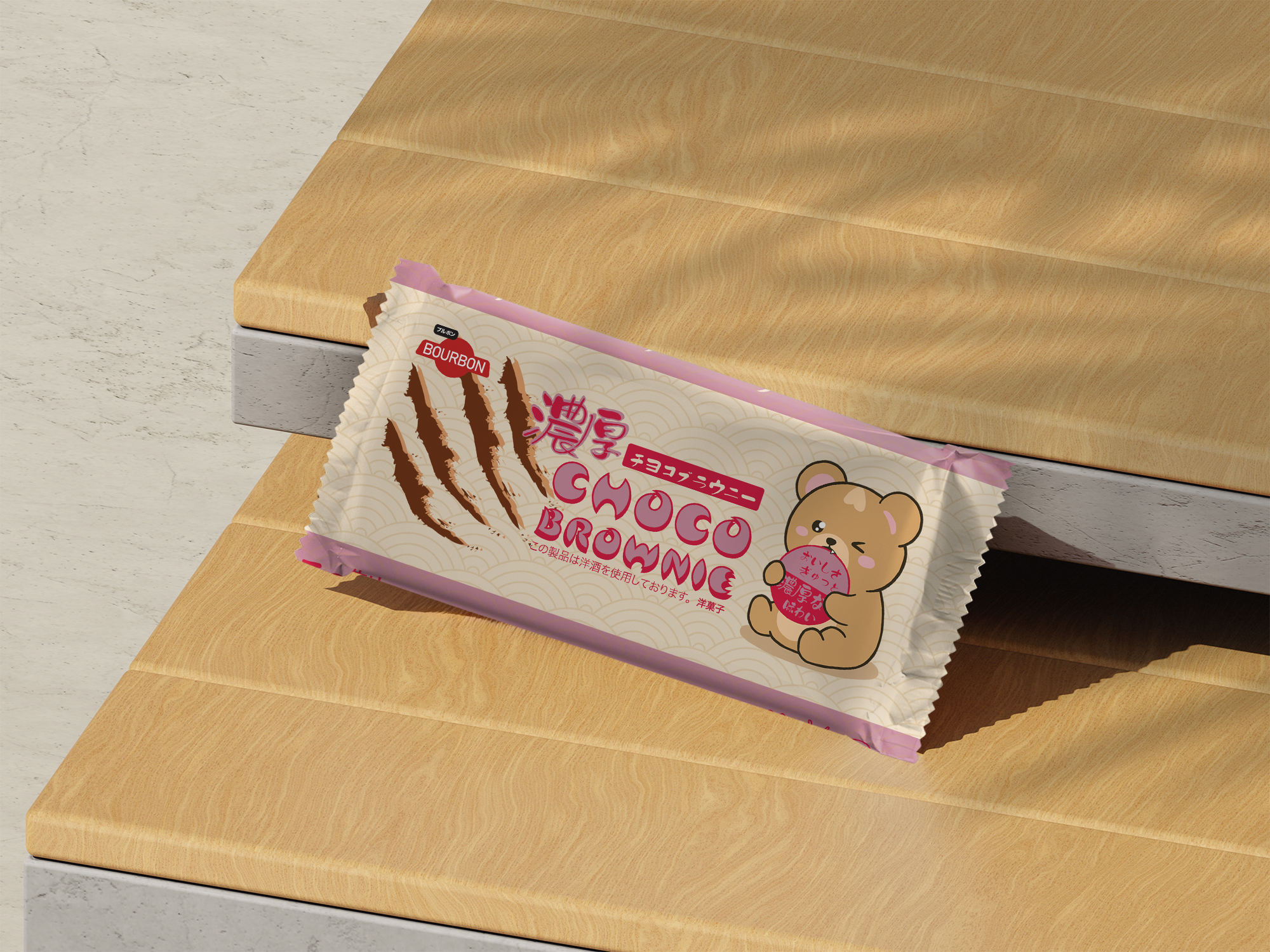
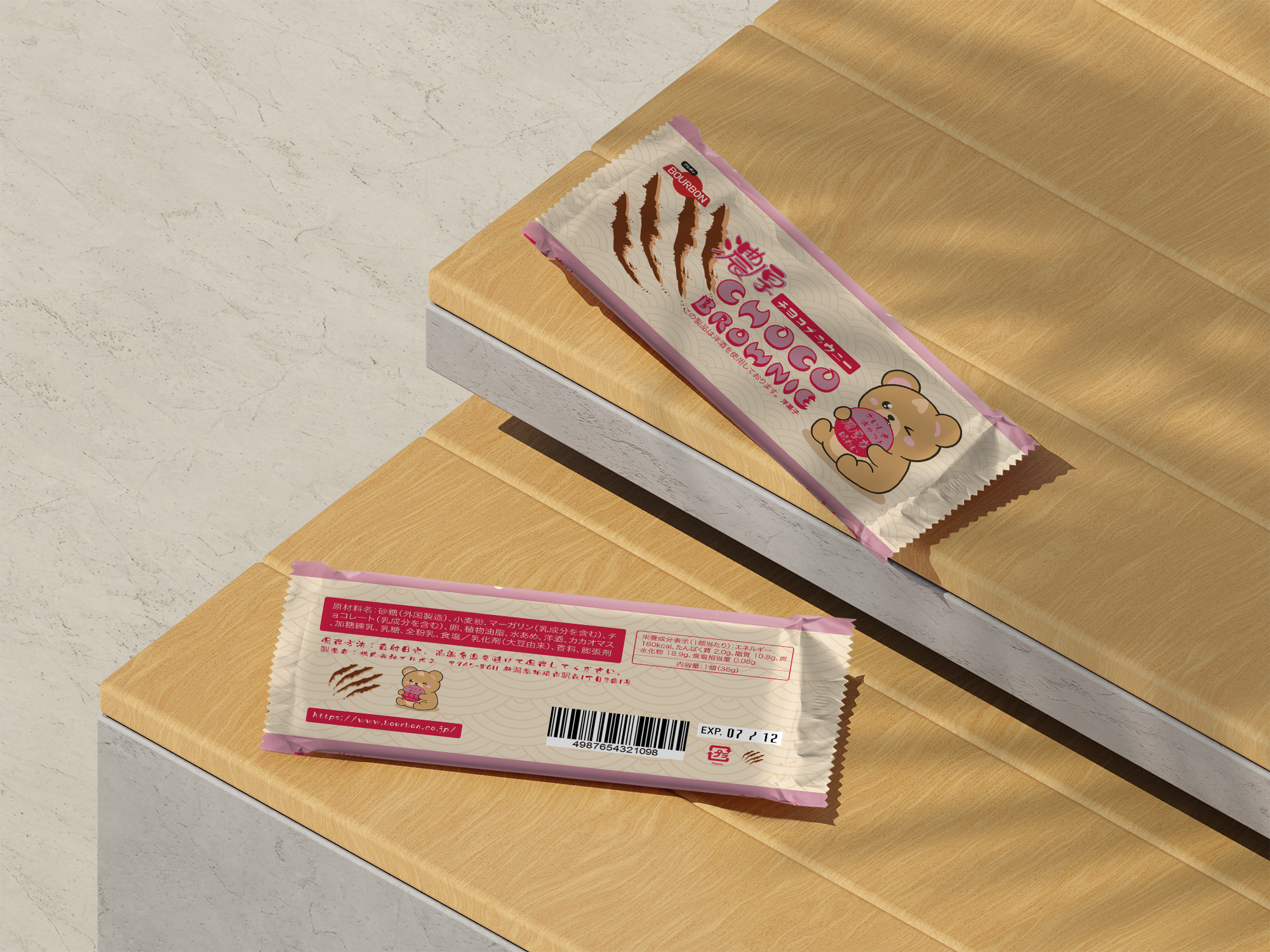
Concept
This project involved redesigning packaging for Choco Brownie, a Japanese confection produced by Bourbon, with a focus on bilingual communication and cultural authenticity. The concept balances English and Japanese typography to create a clear hierarchy that works across audiences while preserving a distinctly Japanese aesthetic. A playful illustrated mascot, a bear biting into a stamp-like label, was created to add charm and personality. The Japanese phrase おいしさぎゅっと 濃厚な味わい ("Packed with deliciousness, rich flavor") reinforces the indulgent tone of the product. Traditional visual references, including the seigaiha wave pattern, were incorporated to subtly ground the design in Japanese design language.

Description
The final design presents a redesigned Choco Brownie package that integrates bilingual text, illustration, and pattern while adhering to supplied brand assets and packaging conventions. Custom artwork was created using Procreate and refined in Adobe Illustrator, combining hand-drawn character illustration with precise vector layout. The packaging explores hierarchy, legibility, and shelf impact across languages, ensuring both English and Japanese text are readable and visually balanced. Background elements feature the seigaiha pattern to add texture and cultural context without overwhelming the composition. The project reflects careful research, thumbnail exploration, typographic testing, and professional production using a supplied dieline.
Visual Assets

