Concept
This campaign centers on the idea of irresistible, addictive heat — a bold flavor experience that consumers can't put down. The concept is expressed through energetic composition, character interaction with Chester Cheetah, and dynamic product movement to visually communicate intensity and excitement.
While the core idea remains consistent, each version adapts to its cultural audience. The American version emphasizes bold simplicity and immediate impact, while the Japanese version incorporates more expressive typography, layered information, and playful visual elements.

Description
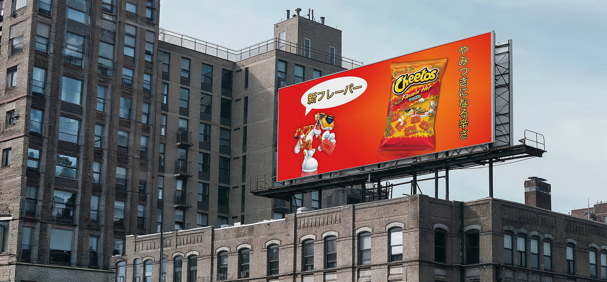
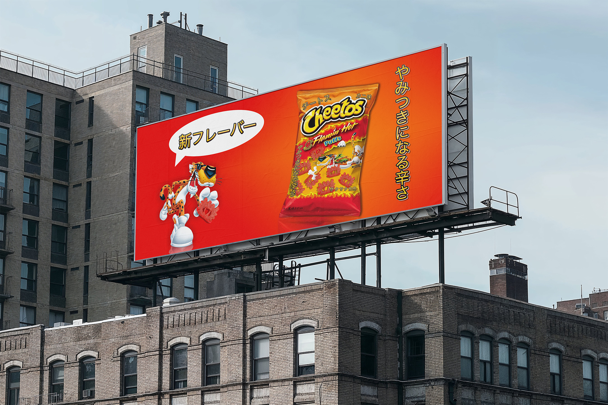
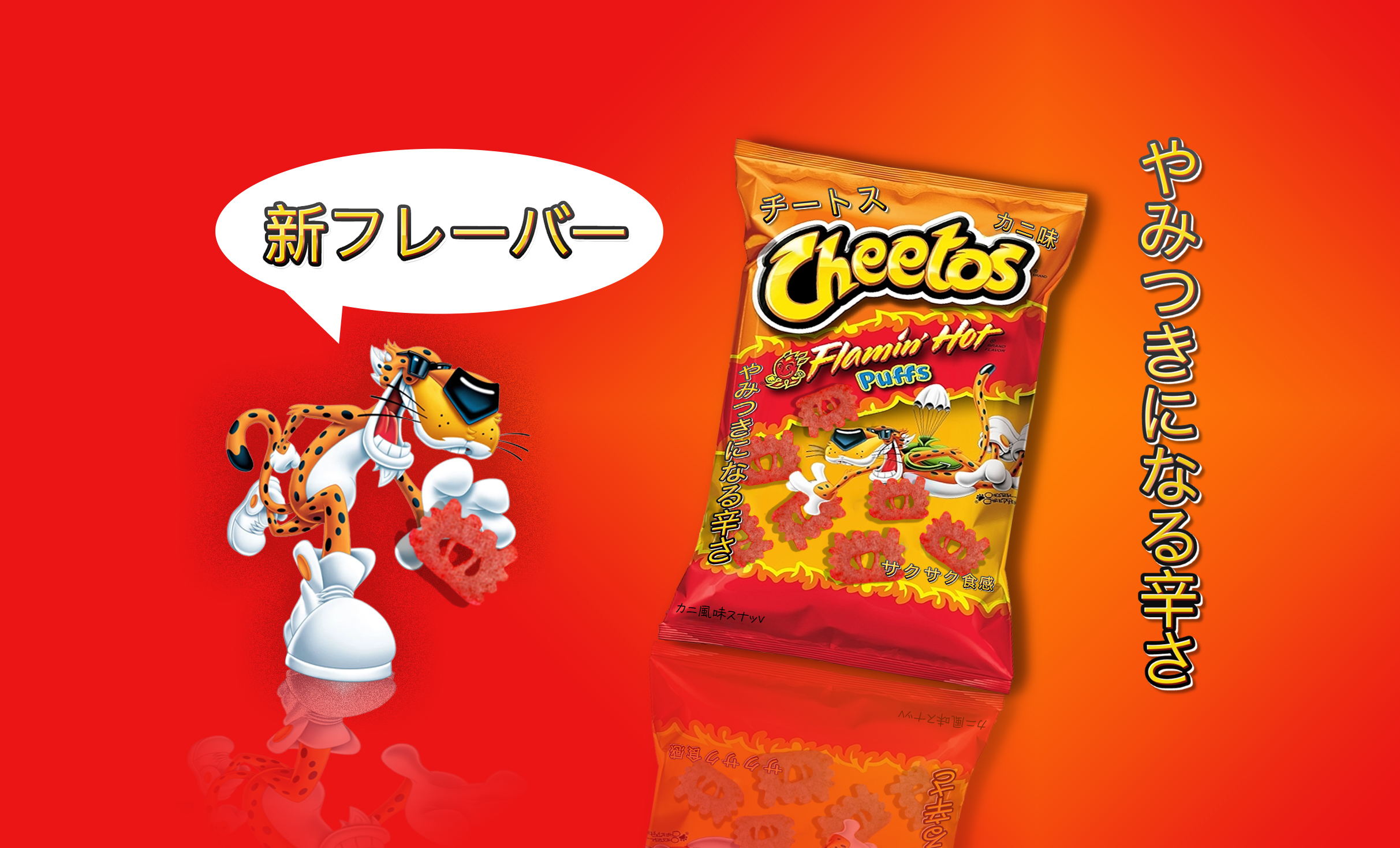
This campaign features two digital advertisements promoting Cheetos Flamin’ Hot Puffs, developed in both English and Japanese. The goal was to maintain a unified concept while adapting visual and typographic elements to reflect cultural expectations beyond direct translation.
The English version focuses on strong visual hierarchy, minimal text, and large-scale typography to quickly communicate the message. The phrase “Heat You Can’t Put Down” is presented in a bold, direct format, aligning with American advertising strategies that prioritize clarity and immediacy.
The Japanese version introduces a more detailed and expressive layout. Vertical typography reflects traditional reading patterns, while additional text such as 新フレーバー (new flavor) and やみつきになる辛さ (a spice you’ll get hooked on / addictive spiciness) enhances product appeal. A speech bubble element creates a playful, character-driven interaction, referencing visual conventions commonly seen in Japanese media.
Color was also intentionally adapted. The Japanese version incorporates a stronger red-dominant palette, as red is commonly associated with excitement, intensity, and appetite stimulation. This reinforces the perception of heat while aligning with culturally familiar visual cues.
Both versions retain English branding on the packaging to preserve global brand recognition, while the inclusion of Japanese text improves accessibility and reflects real-world bilingual packaging strategies.

Target Audience
Primary (U.S.): Teenagers and young adults (ages 16–30) drawn to bold flavors, high-energy visuals, and playful, personality-driven branding.
Primary (Japan): Young consumers and snack enthusiasts interested in novelty flavors, visually engaging packaging, and detailed product communication.
Secondary (Japan – Expanded Market): Bilingual presentation reflecting common packaging practices in Japan, where global brands maintain English for authenticity while incorporating Japanese for accessibility. This approach also broadens appeal to international consumers and tourists.
Usage Note
This campaign is a conceptual design exploration created for portfolio purposes. All brand assets, logos, and characters belong to their respective owners and are used here for non-commercial, educational demonstration only.